For Christmas of 2016 I wanted to get very personal Christmas presents for each family member. Some were researched and purchased and some were made.
For my eldest sister, Corinne, who was the person to introduce me to Art and Design, I knew I couldn’t afford a stunning work of Art or spend enough to get her an Art Deco antique. I decided to make my own Art Deco style Posters for her. Each poster based around her 4 favourite cities. Cork, Dublin, Paris and New York. I was told I would not see my sister until early January. So I was able to set the deadline for then.
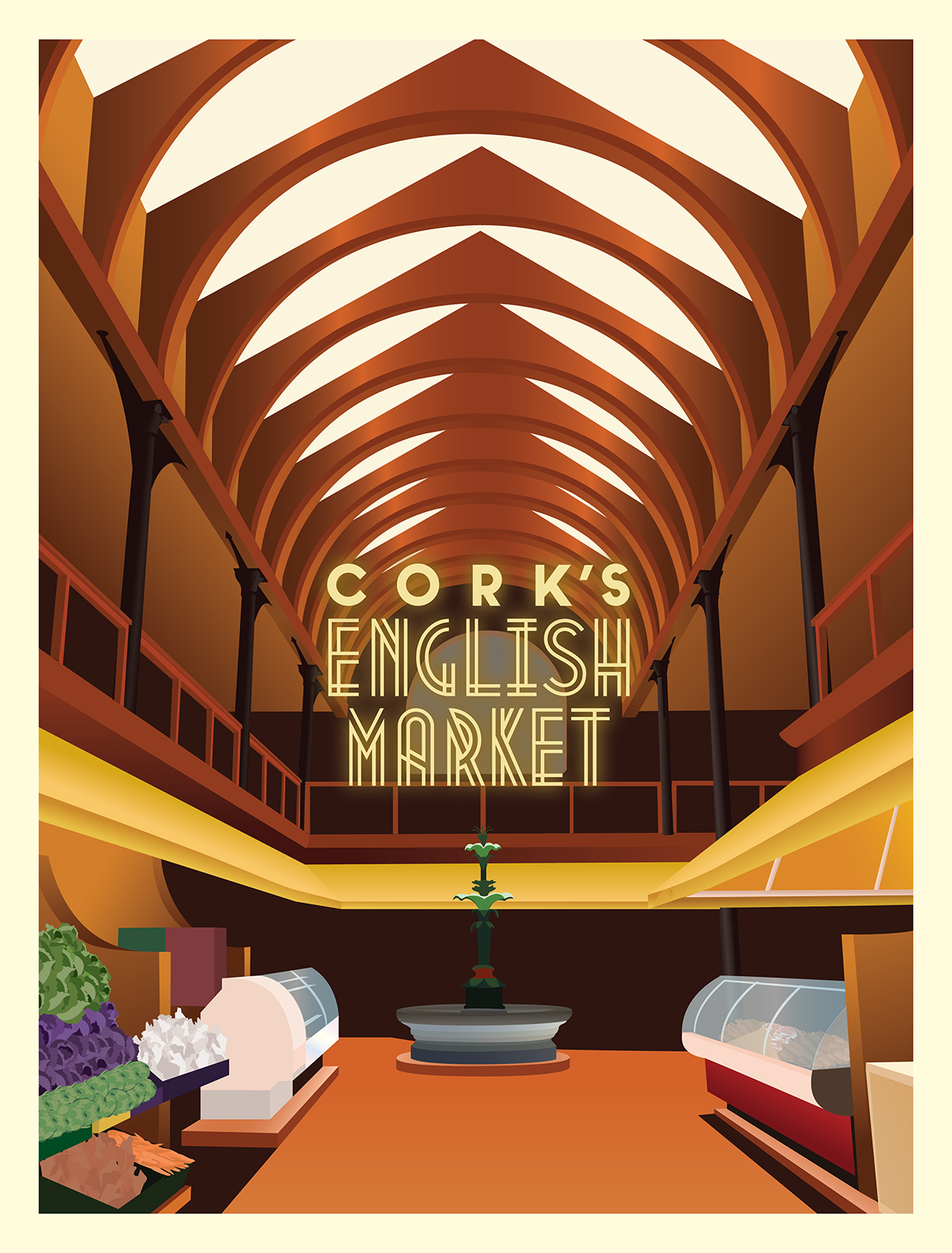
For Cork I wasn’t sure what iconic imagery I wanted to showcase. I had originally intended to make a composition of Patrick’s Street framed by the street lights however I came up short on reference material. I had an Idea to show the 4 faced liar clock tower against the city’s skyline however with the other poster ideas I had in mind I didn’t want too much repetition. My next choice was to make a poster for the English Market. I found a few references to work off of and set a limited colour pallet based on a wooden Art Deco cabinet I had an image of. I used a lot of the wooden tones to form most of the architecture. There was a surprising amount of colour I could use in this pallet. The bright yellows and deep reds were all part of the same pallet which gave me a lot to work with. I continued to use this pallet in most of my other Art Deco pieces using the different tones in different weights. I heavily relied on using gradients to mimic the airbrush texture from a lot of posters of the Art Deco era. Colours I could not mimic with the wooden pallet I grabbed from their source such as the rich purple Cabbages or the stone and copper fountain.
Some of the photo references I used annoyed me in their lack of symmetry so I took some liberties with the geometry of the Market. Centring the fountain and the buttresses.
One issue I faced was the matter of the stalls behind the fountain. I had originally intended to add the stalls in a similar detail to the surrounding stalls but upon experimentation I decided against it as it would be too noisy and busy.
As for the typography I decided on something very stylistic. However now I feel it was more of a trendy choice seen in modern homages to Art Deco rather than an authentic feel. Using the colour pallet I had I was unable to make the type contrast the rest of the piece. I used a Gaussian blur to emit a glow to add the much needed contrast.
If I were to go back and correct certain problems I would have spent some time to create more detailed silhouettes in the background to add more life to the piece. I feel at the moment the life in the piece lasts for a few seconds of viewing however after that I feel its lacking and empty. I don’t think I’d modify the type choice unless I could find an existing stylised typeface from the Art Deco Era. I feel more detail could have been added overall however the time restraint did not allow me to add any details.
The Cork poster did become my favourite of the pieces as I love the resulting colours and the composition of the total piece with its sharp geometry and the allowance for the experimentation of the gradients for the airbrushing. I would like to learn how to better create an airbrush feel from these gradients but I am very happy with its result.
I felt I had given this project an appropriate amount of time considering the tight deadline, all in all I had spent a full two days on this piece from concept to completion although a quite tough piece with the amount of detail involved. With the original time-frame given I felt quite confident in what the end result of all four posters could be. I immediately began gathering resources for the next piece. The Dublin Poster.

