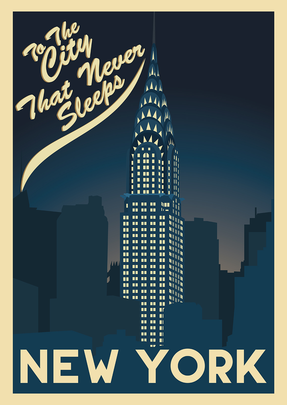
For New York I knew I would have a lot of reference material to work with, utilizing the Art Deco architecture. I had a few ideas of what I wanted the composition to be so I could limit my research to fit those ideas.
These Ideas included one concept having the 3 famous New York Art Deco buildings sharing a skyline in landscape. A composition wherein the perspective would have included the mural from the RCA building with a very vertical format or a very perspective heavy image from base to tip of one of the three famous Art Deco Skyscrapers. The Three buildings sharing a skyline was impossible no matter how much of the geometry of the piece I changed. The sharp perspective piece I had felt like none of the buildings I wanted were ever photographed in the perspectives I wanted or in the right composition, at least through my research. I had played with the idea of separating the poster into three frames but felt it was a little ugly. Finally the composition involving the RCA Mural felt empty and boring.
This meant my options were a more common composition of a skyscraper emerging out of the skyline.
I finally chose the Chrysler building over the Empire State building or the RCA building as the top portion of the Chrysler building played better for its Art Deco style in the Image, along with it being the focus of Corinne teaching me about Art Deco in 2008.
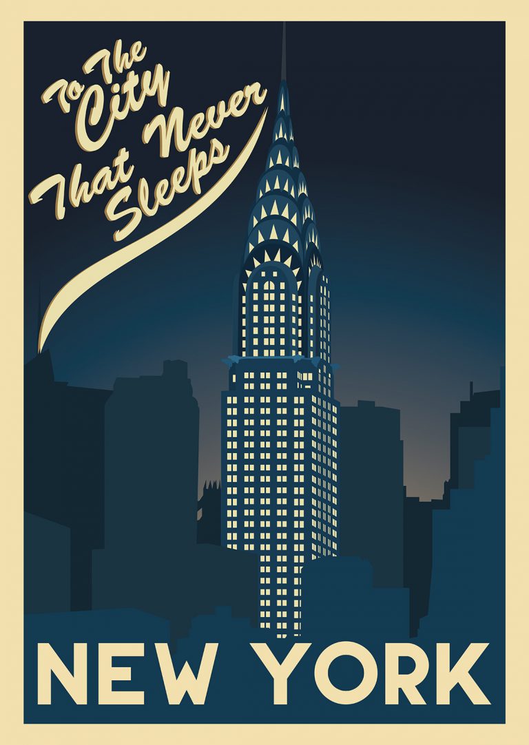
For the final composition I wanted to focus on a sight seen in some of the reference images where the light from the building contrasted greatly with the night sky. I wanted to test out a look to play with the negative space but not too drastically. I wanted to play with the beige of the windows being the light but almost be a knock-out colour.
For colours I re-used the pallet from the “L’Atlantique” poster. Sticking to the dark blues and the background beige pretty much entirely.
For the typefaces I heavily relied on Fabian Korn’s Bonkers typeface. I’ve used it a few times during this project. The Bonkers and Gotham typefaces are surprisingly authentically Art Deco and they have very much helped the type for many Art Deco projects I’ve worked on that do not involve an over the top stylized typeface.
Overall the series of posters were extremely well received and proudly displayed in Corinnes home and being a point of interest for the guests to her home and leading to more requested Poster Design in similar styles.

