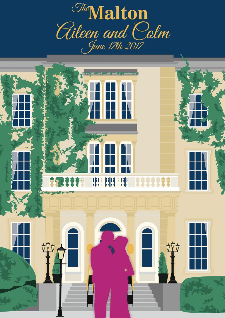
Months after giving the other four posters to my sister for Christmas, a friend of hers visited the house and was shown my posters. She then asked if I could do a commission for her to commemorate her wedding. She asked for the piece to be based on the hotel her wedding took place, The Malton Hotel in Killarney.
As it was a wedding gift my sister, Corinne, decided to take on the cost of the commission to make it a wedding gift from Corinne to Aileen and so a lot of the design decisions would be ran through Corinne before anything would reach Aileen.
There were few requirements requested for this piece. The date and names, the location and a portrait of the couple being centred.
I played with a few colour pallets trying to keep it Art Deco. Corinne suggested I look at popular modern wedding colour pallets. Using certain colours like “Diesel” and Rose Gold. I utilized the Diesel colour for the sky and inside of the building as a form of knock-out colour to look as though the building had been painted directly on the Diesel coloured base. I later went back to the Wooden textures from the Cork poster, sticking to the brighter colours for the concrete of the building and the same blacks for the cast Iron elements.
The bushes continued to be problematic for me as I was unsure of how to go about adding the details of the ivy and bushes or how much detail was appropriate. At times I let it get very chaotic as nature itself is chaotic but after a couple of drafts I found a good middle point between absolute chaos and no detail.
As the architecture of the building is Neoclassical it made the work on the building extremely easy with every aspect of the building being equal and proportionate. Much of the piece was easy to duplicate and modify and allowed me to focus my time on the few issues that I would face along the way.
At certain points of the year the Maltons Ivy blossoms to a red making it look like the ideal feature for a poster about love, however once I attempted to add this colour I wasn’t happy with the outcome. I was saddened it didn’t work but the continuation of the green suited more and would allow for an easier silk screen or if it were painted in the more classical style of the vintage travel posters.
The silhouette of the couple was a feature I wanted from the beginning. Initially I had the silhouettes in the doorway with a much subtler tone however once this draft was sent it was the first change asked for. There was some difficulty in finding a colour from the suggested pallets or from the Art Deco pallet I had. My solution was to pick a mathematically contrasting colour to all surrounding colours however this was still somewhat of an issue. As the deadline approached the only solution I had was one I had used on the Cork English Market text. I added an extremely subtle outer glow to the silhouette to make it more layered.
If I were to revisit this piece the colour of the silhouette would be my only focus.

