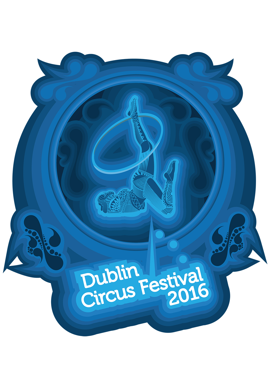
I was approached by a member of the committee for the Dublin Circus Festival in 2016. The client had asked me to make a poster to blow all previous Circus Festival posters away.
I had originally wanted to go with an Art Nouveau style and have things very formal, proper and royal. However the original concepts seemed too formal for what the festival was. The client mentioned that in reality the festival was for college students who expect more of a playful festival.
I was still quite obsessed with Art Nouveau and couldn’t let go of the idea easily. As a fan of Psychedelic Rock the idea for the late 60’s Psychedelic Posters had crossed my mind as an alternative to the original style I wanted. A large amount of the psychedellic rock posters of the time had taken inspiration from the Art Nouveau era with its very floral, flowing lettering and framing and the use of Alphonse Muchas halo frames on a few posters. So I pushed for this style as it would feel a lot more laid back than the more royal feel of the Art Nouveau choice.
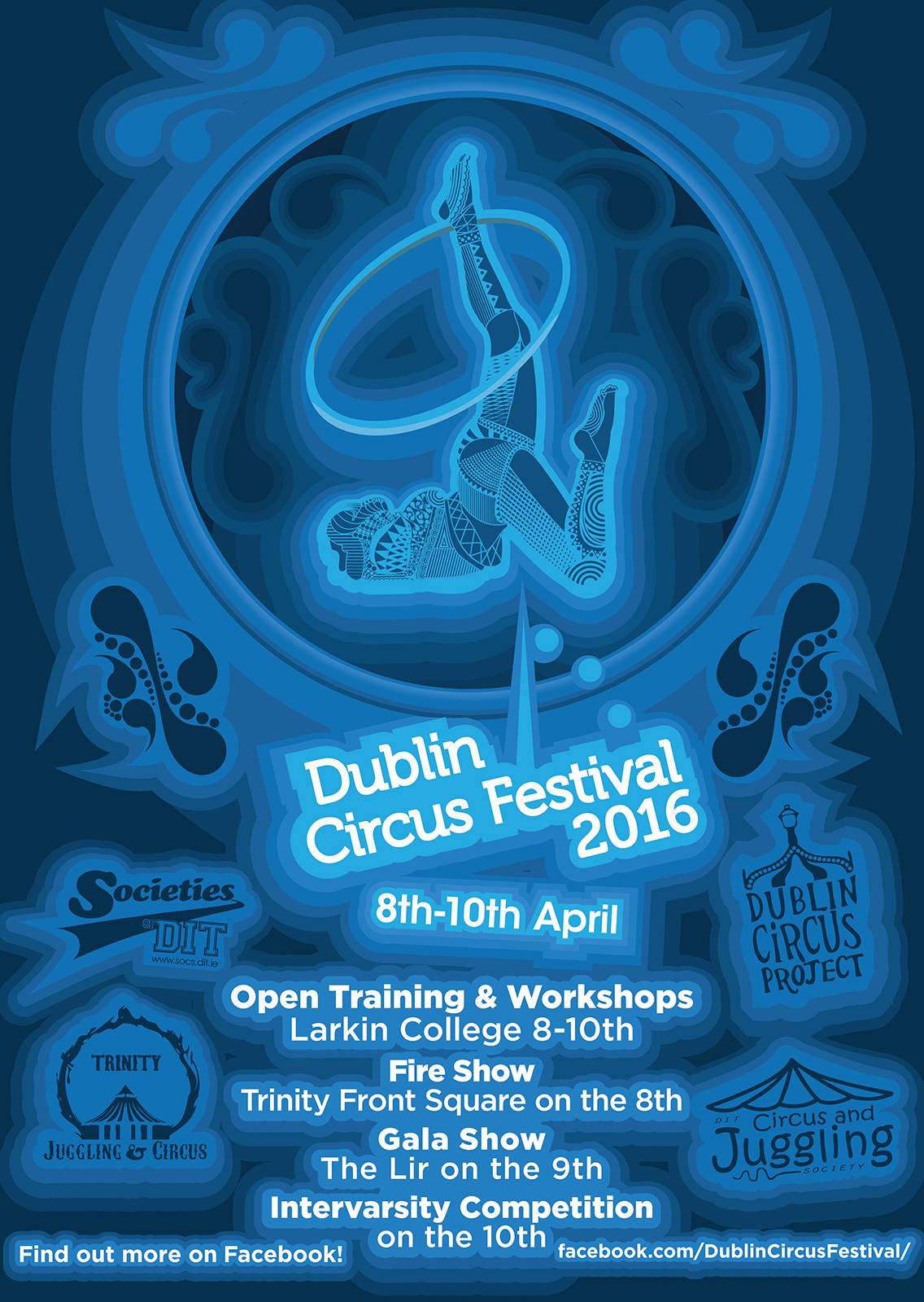
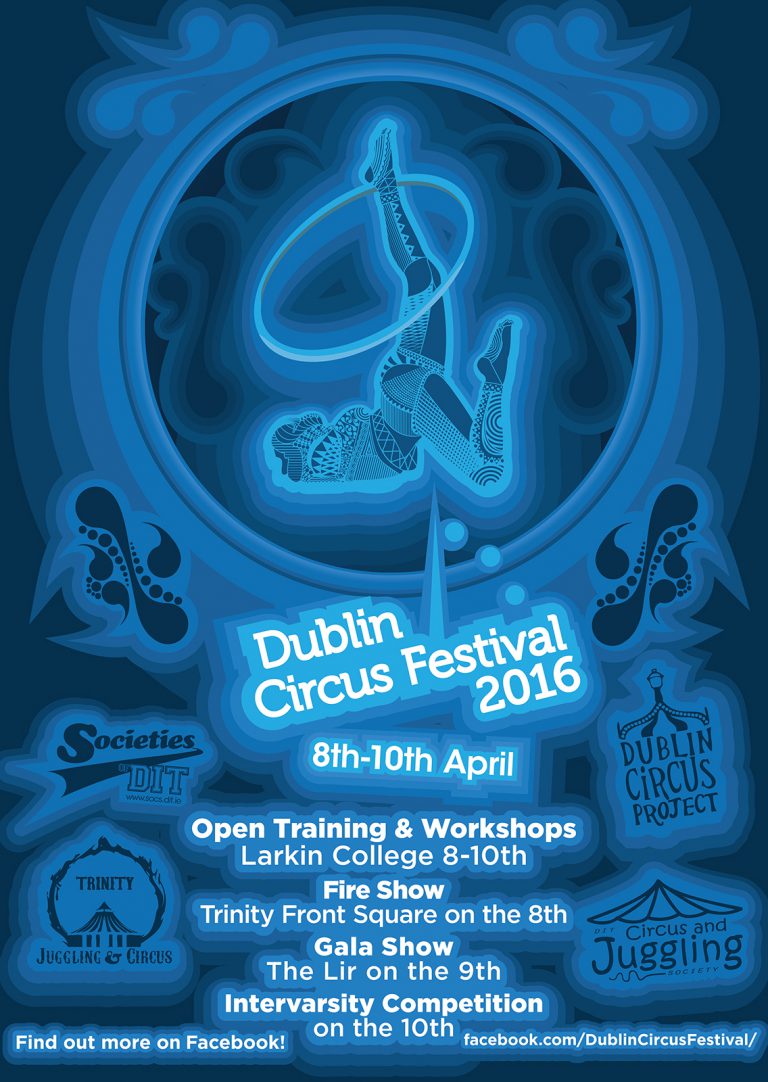
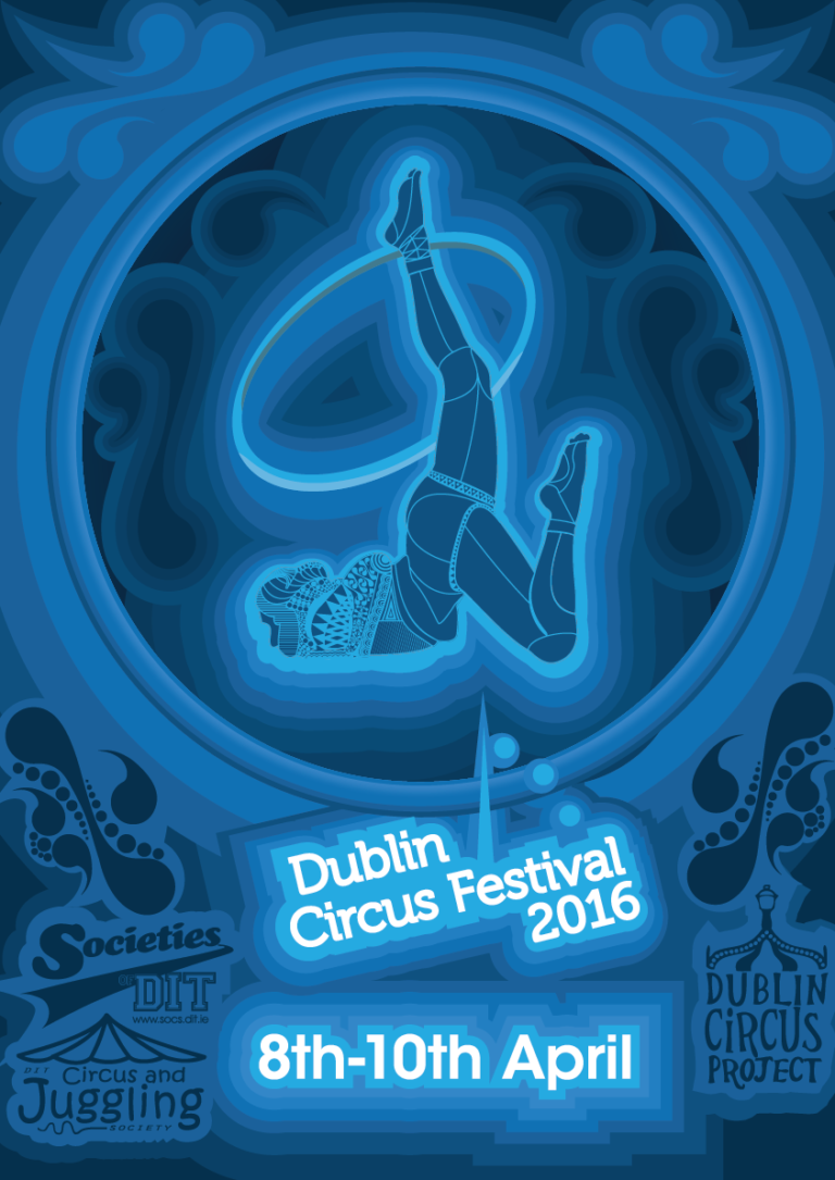
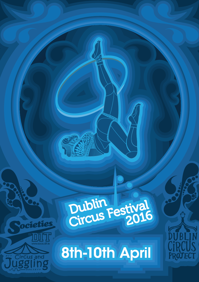
The logo supplied was the white text on a light blue background. Fitting this in to a piece with no blue felt somewhat forced. I began with reds and blues but the reds then seemed out of place. I worked with the majority of the piece in blue and didn’t really want to stray too much from it. The initial portrait was a flat illustration however the client said it felt too flat. I reached out to an illustrator friend about a technique he had been working with and decided to try my hand at it. This fit the style very well and I was quite proud of it. To somewhat contrast the figure I gave it the same blue as the background of the logo. This would hopefully let the portrait, the logo and the date be the main focuses of the poster. It is normally a bad idea to use shades of one colour to contrast something but I felt other colours would seem out of place among the blue. As much of a wrong move it was I felt really happy with the result and decided to go against the rules to make something special.
The client had first asked for an announcement poster. No details would be listed other than the date. Its purpose was just to inform people of the dates the festival would be held. He also felt this would be where the Art of the poster would be seen best and that this was the opportunity to let the design flourish. The client then asked that a second poster be made, on completion of the announcement, that would be filled with the necessary details of the festival. The Committee for the festival were so pleased with the new design that they had wanted to make the design available as a shirt to sell at the festival. I went about making an isolated version of the design that would work with a t-shirt.
