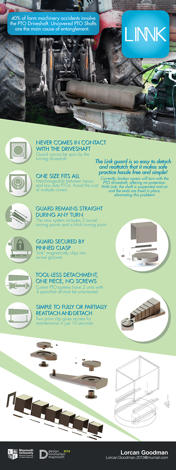
In 2016 I was approached by a student of Maynooth University to assist in their Final year presentation it was an interesting experience in which I was given a 24 hour deadline to complete. The student had the imagery from his side of the project as an industrial designer and asked that I make the presentation. The Imagery of the product, the logo, the technical drawings and the breakdowns were created by the student. I created the presentation, the mock up image and the Icons.
One of the tasks was to create a set of Icons to help instruct certain key points of the device. This is where I had the most fun but it was probably the most complex aspect. I wanted to fully describe the story of each point in a single illustration.
The student was looking for constant feedback which I was very willing to comply with and once the general idea for the icons were put forth the student seemed extremely happy with my work, even before any colour schemes were mentioned.
The imagery provided was of awkward sizes for the dimensions needed being very wide for a presentation that was to be very vertical. I played with the images in ways to get them to fit without losing any details and still keeping the importance of each image.
Since my early days studying Graphic Design I always had a philosophy around the idea that all redundant wording should be removed. Working on the icons I wanted to remove any added need for language. However the student believed that all of the information given was completely necessary even where redundant. I believe since I gave in and listened to the client that the presentation became more whole. It was important lesson that sometimes I really need to reject my philosophies for the benefit of the client.
As a whole I feel this project was a great learning experience and a great exercise. I had the opportunity to play with Icons to tell a whole story in one Image, to exercise my mock-up skills, to work under constant communication with the client, to work with an incredibly tight deadline, to overcome awkward shapes and to really focus on what the client needs over my design philosophies. The entire project proved my strong love of the craft of graphic design and cemented my desire to work in this field.
Link: Production Design Presentation