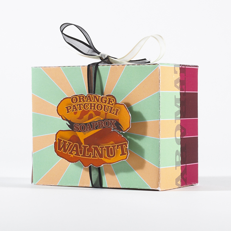
During my Graphic Design Course in my final year we were tasked with a packaging design project. The Brief was to create a branding for a fictional soap company called “Soapbox”, we would then create the packaging for two flavours of soap and a gift box that would include the two flavours together.
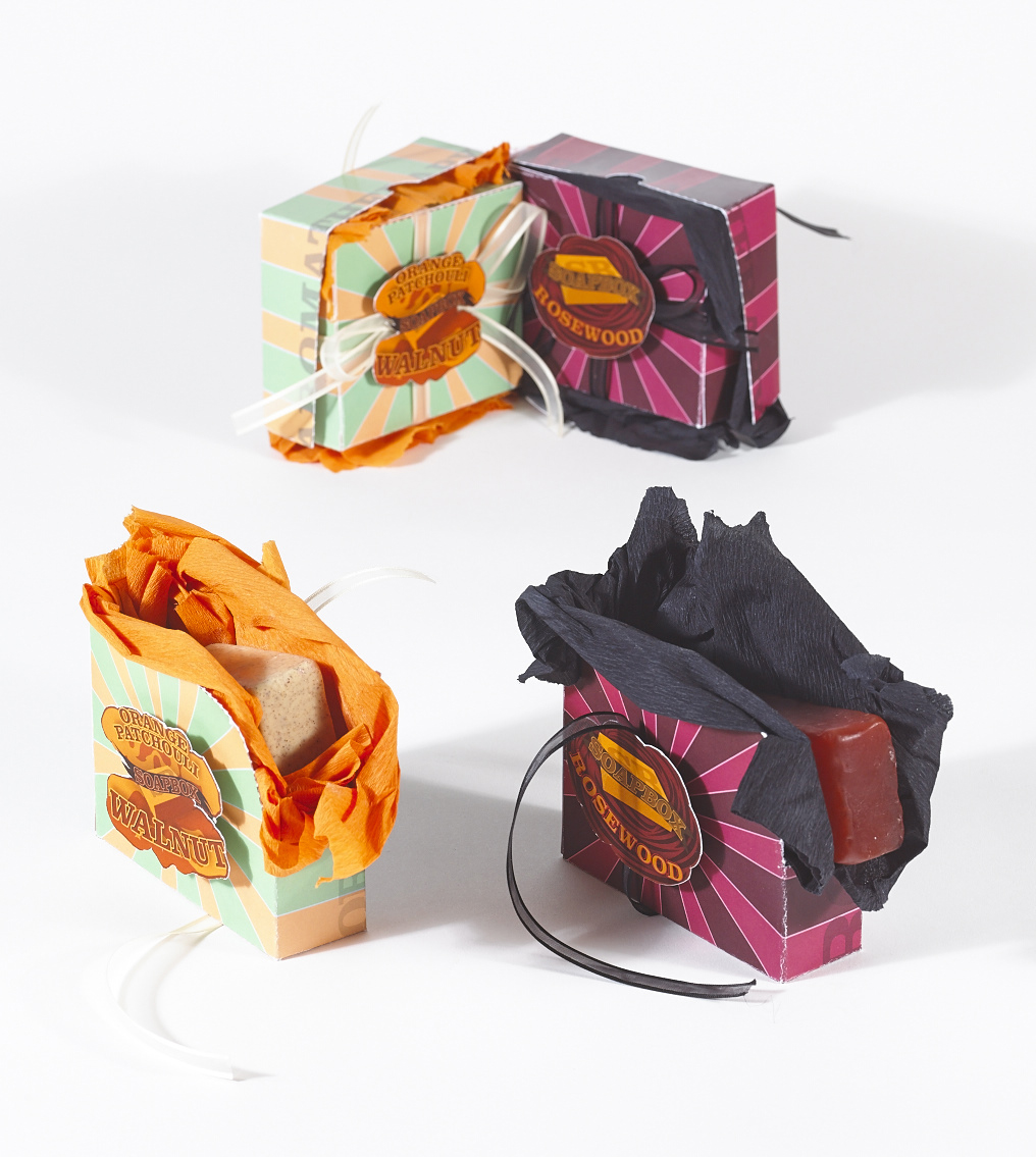
My time in Butlers Chocolate Cafe exposed me to a lot of different and intricate styles of Packaging. My main source of inspiration was from our varied POS boxes, these are the boxes that are used in transporting bars of chocolate however they serve a secondary purpose as a display case on shelving in third party retailers. In particular we had a range of boxes that were partially perforated wherein the upper portion was ripped off to display the boxes. With this I wanted to create something similar however I had the idea to make it a tab of sorts, the tab would be ripped from the box and display the soap among a lining of crepe paper or some presentable lining. As this was just a display box I had no need to worry about the material of the box. Consistently through this project I had wondered about the flaws of this idea however I knew if this was a real project I would really have to do my research on waterproof card or alternatives along with the Crepe Paper.
I had trouble with the colour scheme initially, I planned out some colours based off of a mood board and I had utilized the Kuler website, now color.adobe.com, for a colour scheme which had given me an interesting selection of blues that I enjoyed the look of and matched my mood board. Initially I enjoyed these colours but once I started to mock the box up the colours seemed to work less in context. I continued with these colours for a bit however closer to the end of the project I decided to test what the colours could be if I based the boxes on the flavours themselves. Orange, Patchouli and Walnut gave me a range of colours to work off of however rosewood gave me one colour with a few tones. Working on this I didn’t enjoy the selections but continued on. With my final print of the mock-ups I decided to try the Kuler website once more, this time using the range of colours selected from the ingredients. I played with an Orange and green compound colour scheme and a shades colour scheme for the Rosewood.
The initial concept was that the logo on the side would change with the ingredients but the packaging would stay the same, changing only certain details. However once I got the final colours down I decided this would be a better idea.
I worried for the actual soap to use in the photography, luckily, the cafe I worked in was located a few doors from the shop Lush and we knew a lot of the employees. So I dropped in to them for help. I gave them the ingredients and one of the employees pointed out three soaps that would help. She also managed to secure me a couple of scraps of soap that I was able to take for free which was an incredible help.
Taking as much inspiration from Butlers as I did I felt the need to use a Ribbon on the boxes. It was somewhat of a problem to find a ribbon suited to the colours and that matched each other. Now with my time in the Butlers New Product Development Department I now have come to loath ribbons and constantly seek an alternative.
Soapbox Packaging Design