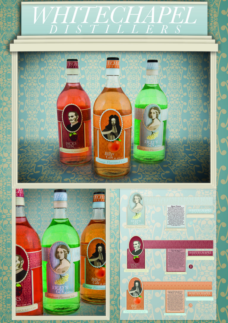
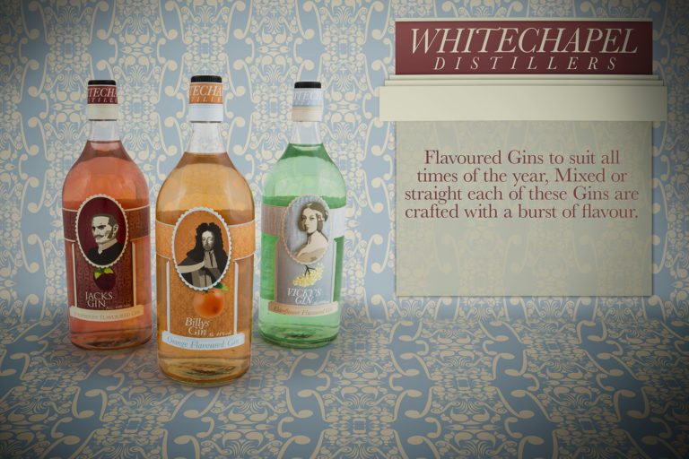
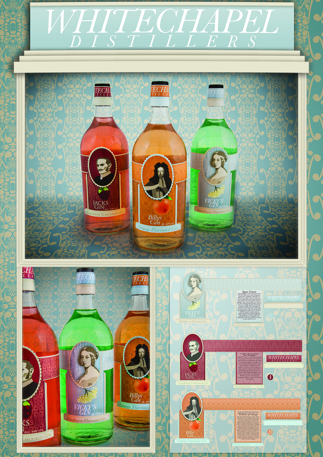
In my second year of my Graphic Design HND course we were given a project to create an attached label for a fictional distillery called Whitechapel Distillers. The project asked that we create a the design centred on three flavours. Jacks Gin, a raspberry flavoured gin, Vicky’s Gin, and elderflower flavoured gin and Billy’s Gin, an orange flavoured gin.
As the topic had been so based around the Victorian era I felt it necessary to put as much of a Victorian spin on it as I could. I took the portraits of each named character, Jack the Ripper, William of Orange, Queen Victoria. The issue with this was each of the portraits were so varied it was hard to nail down one style. The only Image of Jack the Ripper was an illustrated image of the man most likely attached to the profile, The image of William of Orange was a realist painting of William and the younger portrait of Queen Victoria was a very early portrait.
A main aspect of the project I wanted to focus on was the background. I really wanted to hone in on a Victorian-esque wallpaper. This was one of my first experiences making this style of pattern which is a technique I still use quite a bit today. For Vicky I had just wanted to experiment with the pattern. I was quite happy with the result so once I moved on to Jack I decided to shape it more to the raspberry of the flavour. For Billy I focused on making it more of a circle with a leaf to represent the orange.
The colours I worked with were very obvious for Jack and Billy however with Billy I noticed the beige of boarders did not work. So I switched for a similar Victorian blue that I focused on with Vicky. I felt Vicky’s Gin would be the standard flavour so I imagined the Victorian blue being more of a company colour than the flavours colour.
Whitechapel Distillers Gin Lables