In 2016 a recurring client approached me with an opportunity to design the Identity for his personal business. A Swing Dancing focused event management organisation.
I was given full creative control over the design. I started creating mood boards and began my brainstorming, along with certain style bias, the theme began to circle the Art Deco era. Jazz and the contemporary ballrooms really fed into this style choice.
I began drafting hundreds of logos, from purely Initial based logos to abstract shapes however eventually I began to follow classic car badges of the 1950s. I also wanted to focus on the typography to make it work as an initial logo for a stamp and as a type based logo. So focusing on the type initially I eventually worked out something close to the finished product.
From there I would start to sketch out the car badge shape. Simple at first, with a centred circle and boarder lines. While messing with all sorts of shapes I decided on wings. Immediately this fit the style I wanted and almost held the entire piece together.
The final modification I made was to really accentuate the initials both to fit them in visually and make it become more identifiable.
The colour choice was a difficult one. I wanted to try to pick something from the era and something more elegant. I had played with many sample colour schemes. However I was hit with a eureka moment when meeting with the client about the projects progress. The idea was based on Mahogany wooden tables. The initial idea was to have the main colours be based around Mahogany and secondary colours based on green leather desk mats. However combining these colours felt more like a Golf company at Christmas more than the elegant Ballrooms aesthetic I sought after.
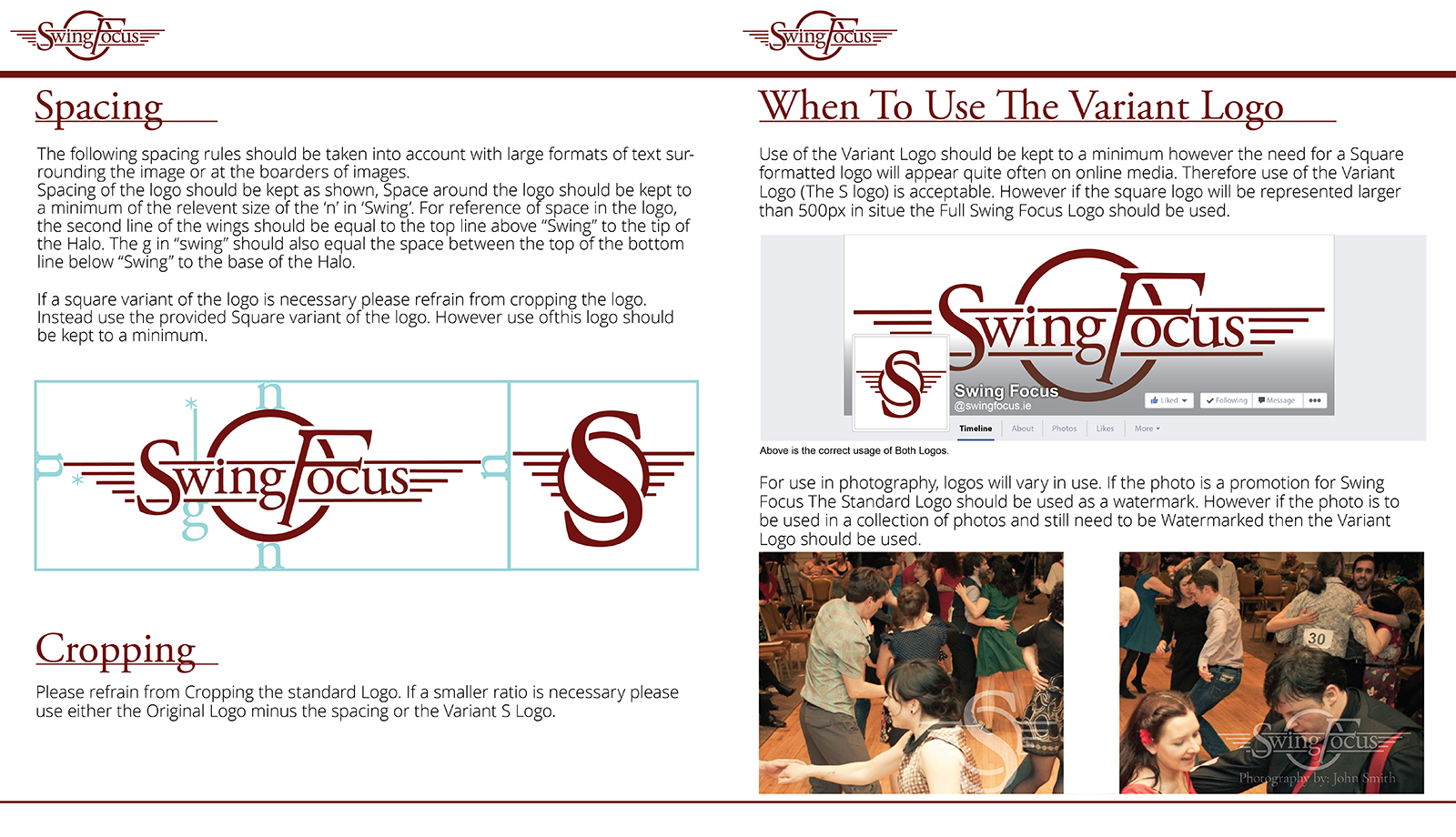
Once I had completed the full logo I began work on an Initial based logo for use with a stamp and for more square based uses such as social media avatars. With all the successful work in place already I took no time at all to design the smaller logo however I was never decided on utilising the modified F or the accentuated S. Returning to the client with the choices they decided on the S.
From here I designed a complimentary style guide with examples of when to use either of the logos, choices of colour etc. a practise I have continued to present as it tends to be incredibly useful for the client.
Swing Focus Logo Design