At the beginning of 2018 the former creator of Swing Focus set up a separate, broader dance event management organisation called Misfit Rhythms.
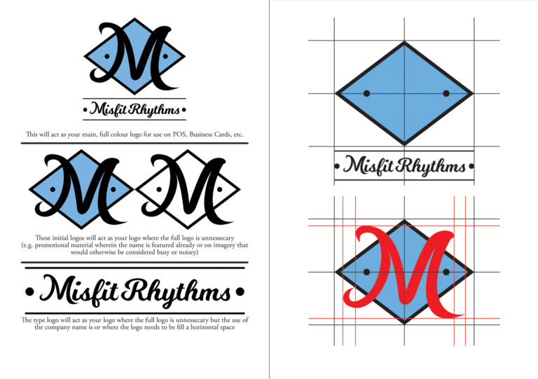
This time I was given certain ideas and rules to stick to. Including It must not be reminiscent of Swing Focus, it should be a crest or Insignia, the colour scheme will be Black, White and Blue. To begin with there was no certain name but I was told the main three ideas to begin brainstorming. A week later I had created numerous drafts but all unfortunately based on the lettering given for the three initial names. The client returned with the decided name that was not one of the original three. Meaning I had to brainstorm entirely new ideas. The use of the words lead to numerous varying ideas, however I had trouble sticking to the clients request to make it a crest or an Insignia. I explained this to the client, we agreed to drop those requirements and soon after we had the first draft of the logo (Seen top right). The logo was completed as a temporary logo to fill in some space and another logo would be made in future to refine the current logo.
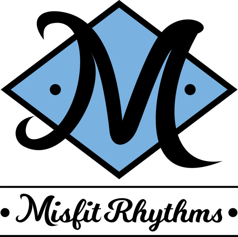
After discussing with the client again we decided to focus on an Initial based Logo similar in use to the Swing Focus “S” Logo. The Client was very happy with the original typography and asked to focus on the “M”. With a few hours work I drafted multiple examples that evolved into the final “M” diamond logo. From there I refined the rest of the text and colour. The Blue was decided from a spot colour I discovered in work quite randomly however I felt it was quite captivating. As with the last Identity design I created a complimentary Style Guide.
Misfit Rhythms Logo Design