atrium-icon-sheet arrow caret reorder back up down info block block attention warning error help flag mug cursor quaver file edit notification wrench person person-small add capped-person folder-person document pin search reblog multimedia palette email google-play like lock cart banknote-euro kite mood-skills mood-graph online-counselling cloud phone folded tag price-tag-euro euro info-centre download upload link branch play-circled article-circled speech-bubble video-subtitle video-camera table off home statistics clock zoom-in calendar newspaper filter send group gallery card wallet folder zip dna legal select circle-outlined check zoom share image adobe-ai adobe-ps adobe-ae adobe-pr adobe-id adobe-au video menu hexagon more close graph plus Directional Turn2Me eCurve Symbols & Actions UI Controls Emoticons Files, documents, media & folders Objects & pseudo objects Time Finance & Commerce Geometrical Text & Editors Humans, Animals & Emojis Messaging Logos Devices Map, Transport & Location support-group check-all roadsign badge suitcase print chats message facebook twitter pinterest tumblr google-plus youtube delicious instagram laptop mobile tablet apple circle location airplane globe delete cog-complex star square triangle history feeling-great feeling-good feeling-okay feeling-bad feeling-terrible feeling-fail diamond octagon

Tasty’s Kitchen

At the beginning of 2019 the manager of Pillar Bar asked if I’d like to help him refine the existing logo for the pubs kitchen as it was undergoing some changes, including its name being changed from Big Tasty’s to Tasty’s Kitchen.
The manager gave me the few reasons why he needed the help including long wait times and an unprofessional feeling. Which all helped in understanding what was needed.
I started the design that night and finished by the next day and created a complimentary style guide. In this style guide I had made an effort to reduce the redundant information but include as much valuable information as possible or solving problems they may encounter in future such as needing to rebuild the logo or fixing scale.
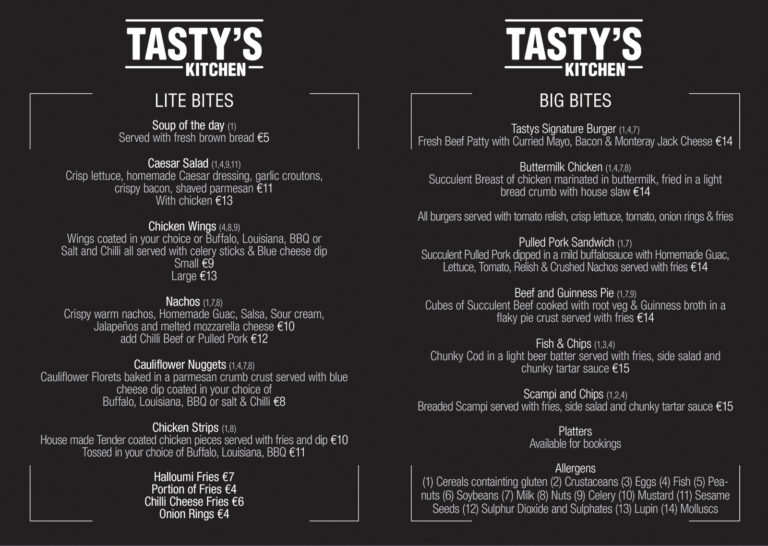
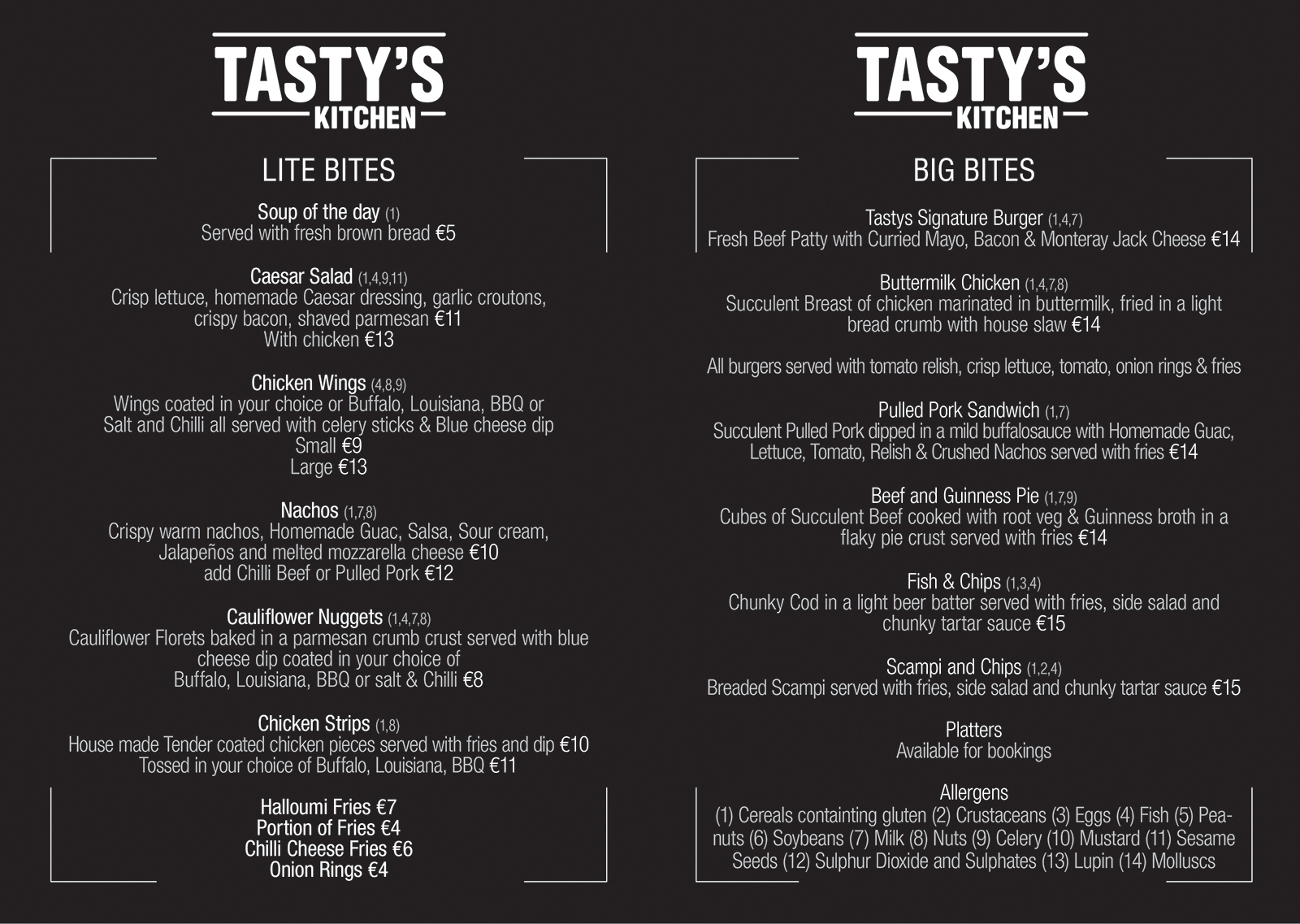
Upon completion of the refined logo the manager asked for assistance in creating a new more professional looking menu. The current menu was a plain white A4 sheet but the manager asked for a more professional look on a folded A4 sheet to utilize the 4 pages.
The Pillar Bar is generally quite dim in its decor and I wanted to make something to both suit the style and that might be easier to see in the dim light and making the less important information fade slightly enhancing the titles and pricing.