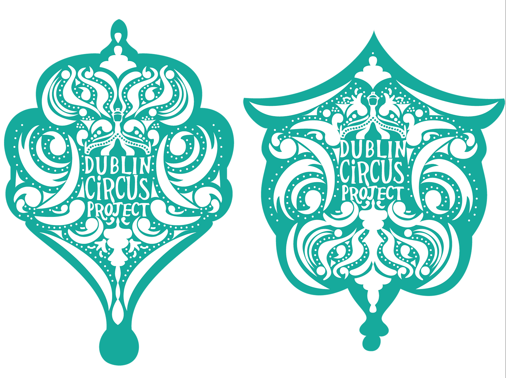
A member of the committee from the Dublin Circus Festival had seen my work for the festival and reached out to me to design a shirt for another group, the Dublin Circus Project. As this would be a design worn for the same event by a close group, I kept a similar style to the Dublin Circus Festival in mind but kept it to a more logo oriented piece.
The client asked that the logo be featured prominently but to have a similar intricate Art nouveau style. But allowed me to go my own way with it as much as I would like.
I was away from home once the client had organised this and once returned home I would not have a lot of time to complete the project before it was due. I decided to gather the few resources I had while away and see what preparation I could accomplish before I returned home.
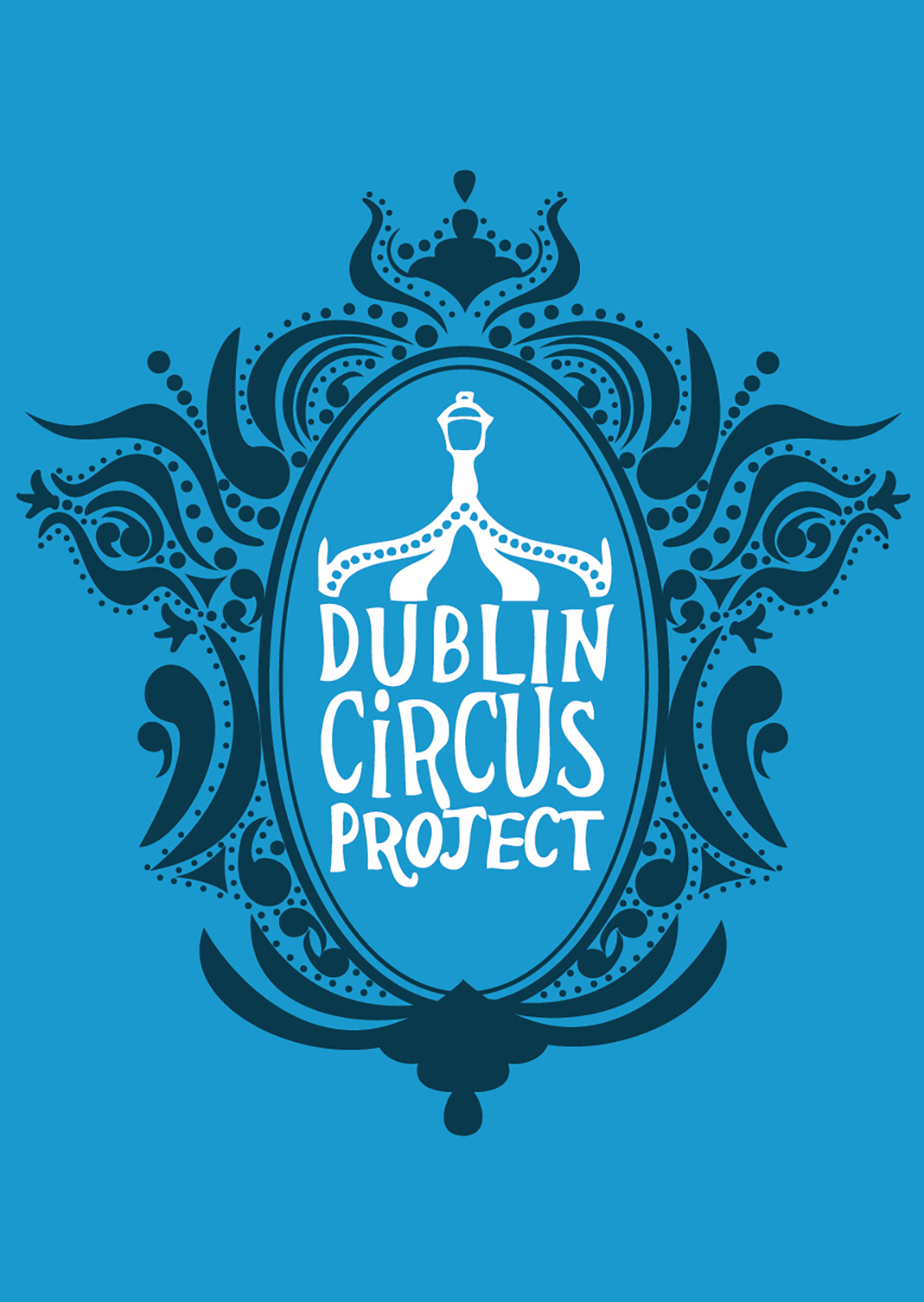
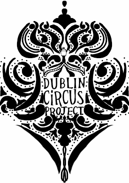
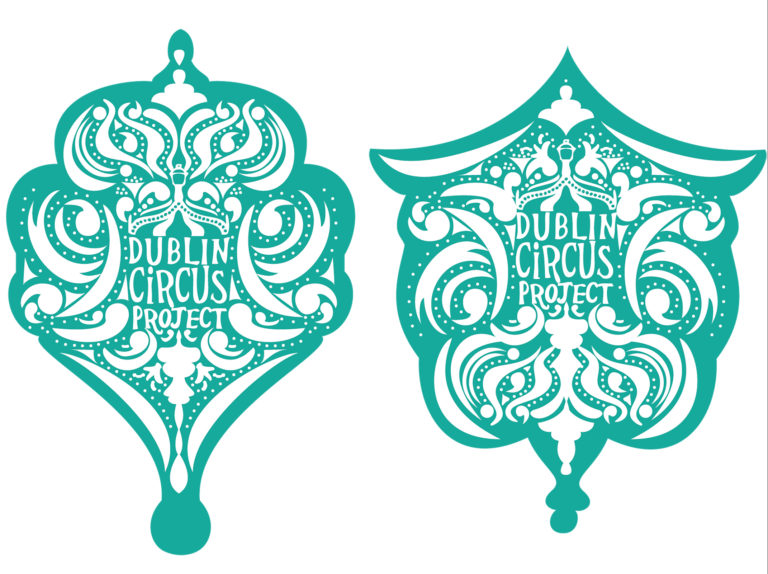
I sketched out some patterns and shapes that the logo would fit with the same Art Nouveau style. Eventually I was able to download the app SketchBook on my phone. I started attempting to sketch more and more intricate and symmetrical patterns to surround the logo. Eventually I landed on the top Image. I felt very limited with the app but I was quite happy with the look. Once home I vectorised the frame and sent it out for approval, however once the client returned to me they mentioned they wanted to scale the logo up further so it would take up more of the image. The next day I brainstormed a few ideas of how to better use the elements I had created and to really showcase their logo. Using Victorian frames as reference I realised the oval shape of some of the frames was a prefect fit for the logo supplied. From there it was a matter of framing the mirror shape with rearranged elements from the initial vectorised logo.
I had worked on multiple different looks to the piece overall and once I had completed the new style with the Victorian frame I was still somewhat unhappy. I left the project for the night and came back to it the next morning. I decided that the piece was too bottom heavy so I rotated the frame 180˚ resulting in the final piece. I felt a lot happier with how this looked and was quite astonished that it simply took flipping the image to get the result I desired. This became a common thing in later practice where if I am unhappy with a design I will simply flip the image either vertically or horizontally to see if I am happier with it in that orientation.
The project was completed on time even with the limitations with my personal holidays. The total time I spent on the work was just above average and it ate in to my personal holiday slightly so I knew it would have been a pricey project once finished. As the project was for a circus society in a college I had assumed they would not have the funds to accept the price and with how happy I was with the end result I decided to adjust the price to ensure its completion. Once I gave the invoice I expected the client to still be a bit annoyed with the price, however they ended up extremely happy with the price and actually quite grateful as the lowered price allowed them to print more shirts and make better use of the design as a whole.
Working on this project I was able to get a proper feel for working on multiple strict deadline projects at once even with other obstacles in the way. It was also a great exercise in working with very little to achieve a finished piece. I had worked quite limited with other projects before however this project really pushed what I had the ability to do with very little.
