Once I completed the present for my sister my mother asked for a version of the posters for certain nice cities and monuments she would like. The suggested landmarks were hard to find imagery of and hard for me to get to so I decided to wait until a new idea came to mind.
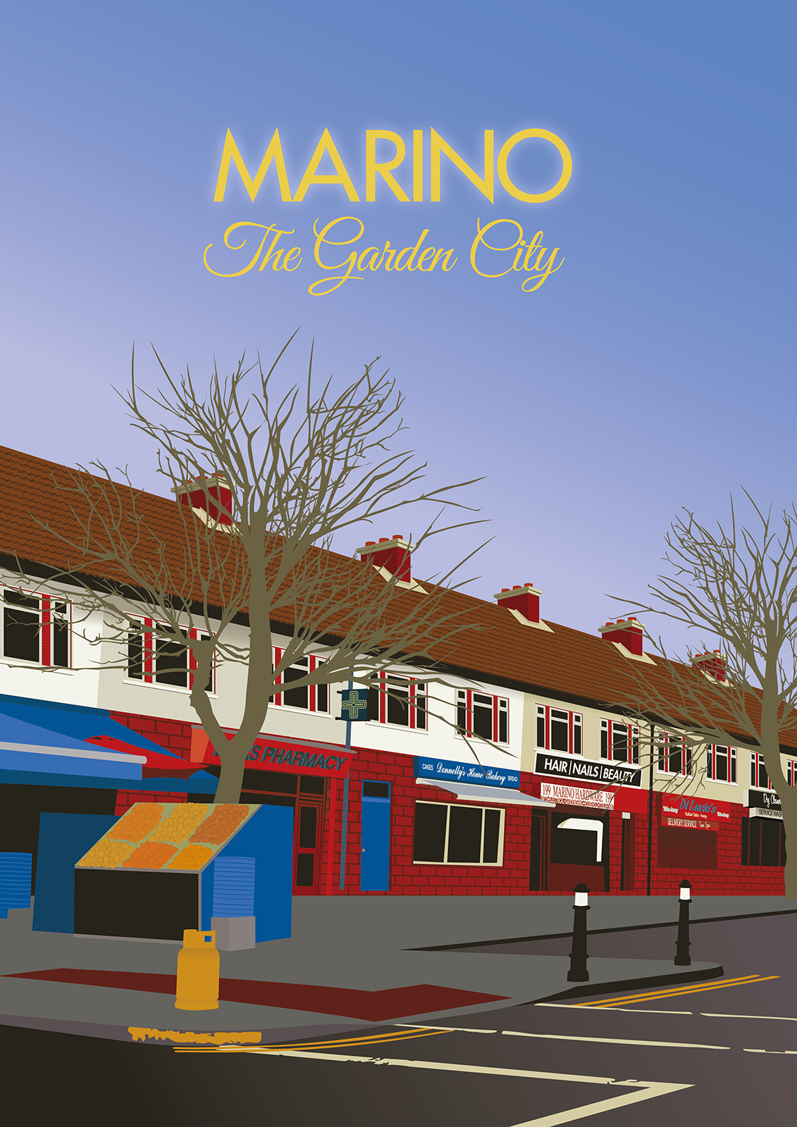
For her birthday in 2017 it finally dawned on me what to do. I’d focus the poster on an area I could reach, that would mean more to my mother. I decided on her home town from when she was growing up, Marino, Dublin. I couldn’t find any good images online of it so I organized with my dad to take a short trip down there one Sunday morning to take photos of her old home and areas she would have hung around as a teenager. Because we chose a Sunday morning the town was quite sleepy, however once we got to the main areas of Marino we were faced with post church traffic. The Image chosen was shot in a brief second between cars but I was very happy with it. The angle we got from the side of the road were quite striking and I thought I could easily shape this image into something that felt very Art Deco.
Once I finished shooting I had a choice, out of all of the photos I had to decide between my mothers childhood home or the shops that make for a better tourism poster, that would also help evoke more of a feeling of nostalgia of the area rather than just memories of the family.
I wanted to keep certain elements out that were too modern, I did not include any Cars as that would signify a specific time the poster was set. I left the names of the shops as many places stayed the same, especially my focus of the poster, Donnelly’s Home Bakery, where my mother took us as kids to get the most perfect Swiss Roll for dessert on a Sunday or to have with our tea when visiting our Grandmother. A lot of the choices on what to include were chosen based on my own memory of Marino as a child.
For the colour palette I decided to use the same colour palette from the original Art Deco posters but allow for more vibrant colours that matched the colour of the shops. Looking back I feel I let myself have too few restrictions in the colour. The blues were too blue, the reds too red. However as a whole I feel the sky brings the tones down to a more reasonable level.
The sub-line “The Garden City” came from some research of Marino. In its construction the planners wanted to build a small city surrounding gardens and greens. They referred to it as “a Garden City”.

