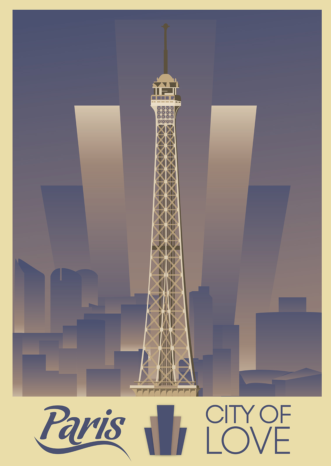
For the Paris Poster I had an idea for the composition I wanted and with the new deadlines in place I did not have a lot of time to experiment so I had decided to push with that Idea.
Originally I wanted to have the upper portion of the Eiffel tower against a skyline of the more classical architecture of Paris. However the height of the classical buildings didn’t line up well and one of my reference posters was very close to this idea already. This resulted in using the more modern skyline. One of my intentions with the poster series was not to hide the modern aspects of each city so that it would be obvious that I am not trying to forge a classical poster but making an authentic modern homage. This is obvious in the Dublin and Paris Posters, however I decided to keep the modern skyline quite minimal in this piece. However I feel this made it seem of a much lower effort.
The fan pattern to me is a very common aspect of Art Deco designs. Its a relatively simple design but I wanted to test myself to see if I could make it as authentic as it should be. It was also a good exercise in the airbrushing inspired gradients.
The fan at the base was originally intended not to contrast the boarder and to act as a frame decoration rather that a centrepiece similar to how it is featured in the back of the image, blending in to the skyline. My attempts at this were ugly and boring. Experimenting with the colour pallet I had, the configuration I went with was the least ugly.
For this pieces colour pallet I wanted to continue the experiment of using one posters colour pallet. For this I ended up using a classic Paris tourism poster. My intentions were based more on the purples of the poster than the subject but I feel now it is too similar. If I had had the time I would have tried to modify my piece more to stray away from the look of this poster. The same poster also inspired the heavy use of gradients throughout most pieces in the collection.
One of my problems with this piece now is that I feel like the skyline was too rushed and that it shows. With the deadline being moved closer I felt rushed and wanted to get the idea on paper and move on leaving no room for further experimentation and barely any time for corrections. This meant the logical side of my brain wanted the skyline to be somewhat realistic and the creative side wanting it to be balanced and pretty. Which led to a compromise I am not entirely happy with. Though I am not entirely upset with the piece as a whole. Alone I feel the piece works and accomplishes what I set out for with the entire project, it is when this piece joins the others that it feels very lacking.
One aspect of this poster I was quite happy with was the Eiffel Tower itself, I was lucky enough, through my research, to find a full schematic of the Eiffel Tower. I had also found a lot of references of the tower over the older area of Paris but as I wanted to feature the more modern parts of Paris this skyline was of no real use to me. They were, however, used for was a study of tones on the tower and for perspective study. The photography also framed the tower in a composition I found interesting. So I utilized that with the schematics I had found. I then found some other Imagery of the modern skyline online and manipulated them together as a more useful reference. It can feel quite odd to see the disembodied top of the tower as the centre frame as most use the whole tower or as much of the tower as they can fit, however I decided to push for this section of the tower as one reason allowed more detail of the tower itself to be seen and to see the skyline more than the park view of the tower.
If I were to do this image again given more time I feel I would take it in a different direction. Perhaps a street level view of the tower works for a reason. As happy as I was to get those details of the tower in place I feel what would be better is a Street level view of the tower between the classical buildings of the streets that lead up to the Eiffel Tower. I remember myself getting lost through Paris and coming across this view and being astounded by the view.
Paris Poster