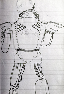
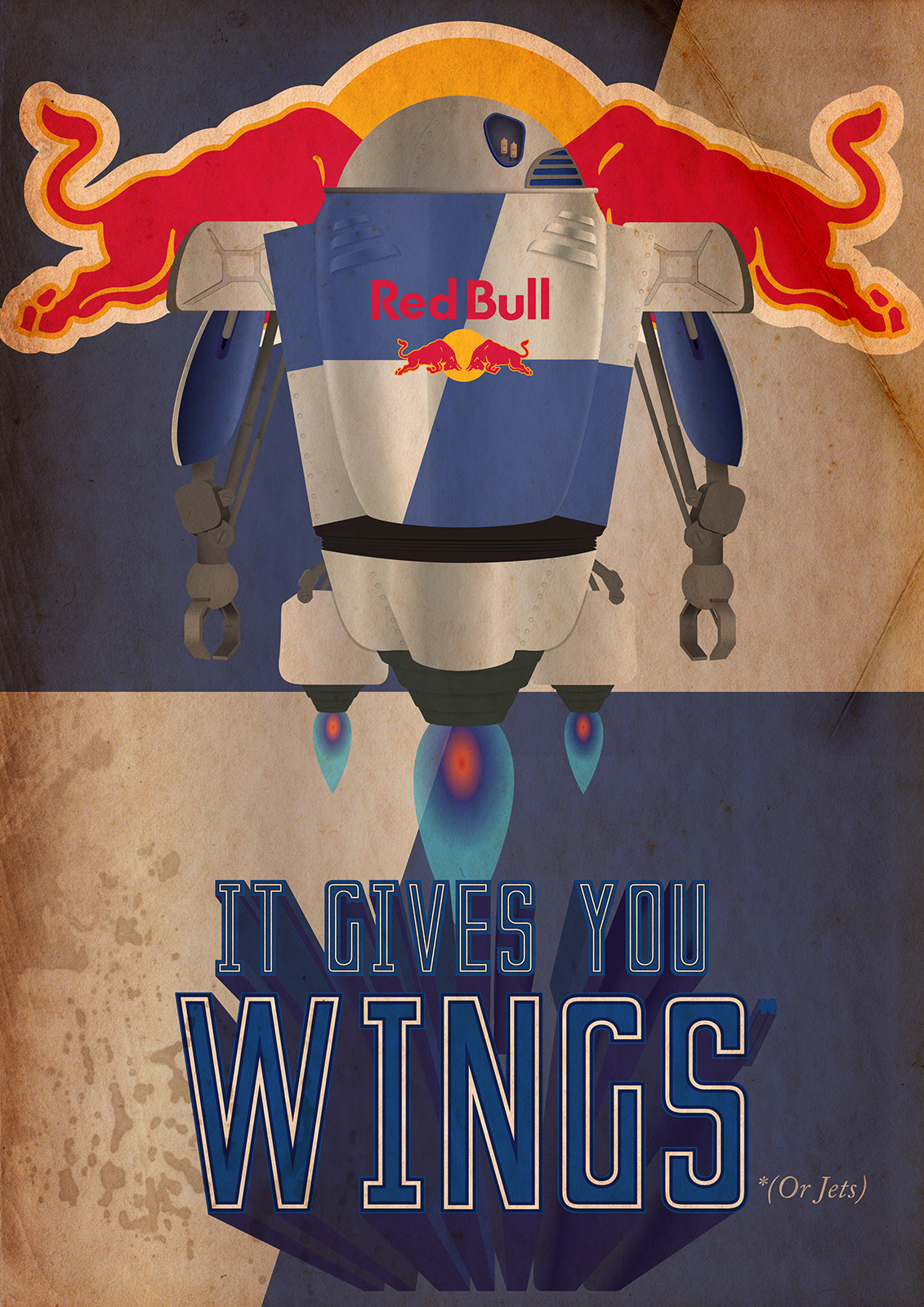
In my Graphic Design course in 2014, towards the end of the school year we were tasked with creating a vintage style robot mascot. We were asked to pick a brand and a product by that brand. Then create a vintage style robot and a poster to promote the brand with the retro robot. Again I had great fun with this piece utilizing favourite brands and a love of the classic retro-futuristic sci-fi design.
For the vintage style I looked at many children’s toys and toy robots of the 1950s, streamline cars and bikes and looking at Googie architecture. I also turned, once again, to my favourite video game series, Fallout. All of which were a great fountain of resources and led me to have near hundreds of thumbnail sketches of shapes and designs along with ideas of the brands to choose. Initially my favourite designs from my sketch book were surrounding the company Monster Energy. The initial sketches had a much edgier look with a sharper shape and darker colour scheme in mind. However I was unable to spin the brand into a retro look. I had still really wanted to use the robots design but the other brands wouldn’t fit and classmates had already chosen some obvious soft drinks. It had taken me far longer than I would like to admit before I thought of Red Bull. Once I had decided on Red Bull the rest of the piece fell into place. The only issues I had with the illustration was getting the chrome of the can to look on point, I ended up utilizing the Mesh tool and using a real Red Bull can to achieve this effect.
This project was at a time when I feel I was at full knowledge of what i can do with Illustrator. Other than the vintage texture over top of the image the entire image is created using Illustrators features. Everything is done using the Mesh tool, Gradients, Shape tool, Pen tool, and Illustrator Blending modes. My use of gradients may have been a bit over the top but I feel I got the result I wanted.
A lot of the gradient use was quite restricting however it did let me do more with my piece. It was a choice of either using a circle or a linear gradient. A flaw can be seen in the lower portion of the robot, the centre riveted metal piece worked as a linear gradient however it needed to be in more of a cone shape than a straight line. The majority of the gradient still works, however one line feels out of place on the left, if that line alone was at an angle following the shape of the metal piece it would work better. The Jets after-burn was also quite awkward. With the radial gradient I could only shape it so much, the result I got I was still quite acceptable. Only under scrutiny does the pattern start to fall apart.
The type is the original Red Bull Slogan, the 3D text effect was more practise on an aspect of a separate college project we had worked on.
I had intended on just using the slogan and not questioning its context however with the contemporary Red Bull advertisements they had been poking fun at their own slogan a bit at the time. I felt it would be a good idea to do the same with the minor detail of the “*(Or Jets)”. I also felt this idea would be quite on brand for Red Bull.


