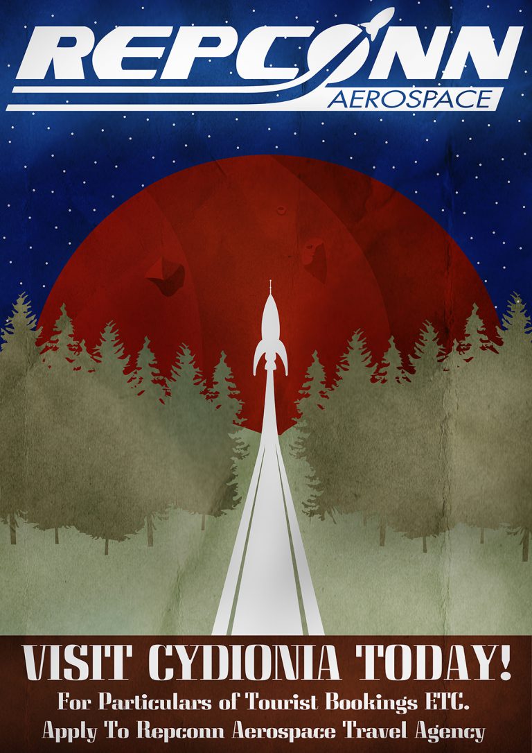
In 2012 my Graphic Design HND class were tasked with creating a retro styled space travel poster centering around a fictional space travel company we would create. We used classic travel posters for inspiration.
I had great fun creating the piece for this project and in doing the research. As a portion of the project stated that we were to create a fictional brand I was a bit worried my time would be centred around the creation of the fictional brand, my tutor stressed that that aspect of the project would not be graded. I asked if it would be acceptable to take an existing fictional company for use in the poster which was agreed upon. This also meant I could pay homage to a favourite topic of mine.
I based the poster around a favourite game of mine, Fallout and a particular company featured in the game, Repconn Aerospace.
I had a number of different ideas all of which surrounded the idea of a 50s sci-fi style of rocket ship taking off with a trail behind it. The poster I ended up using was for a French rail system, promoting travel to Mont. Blanc. Going with the “Vers le Mont. Blanc” Poster made things a lot simpler as I utilized the rails to mimic the rocket trail and replaced the mountain with a view of Cydonia, Mars along with the face of Mars.
An aspect of this project was to learn the use of textures over the top of the Image, this was a technique I was already used to as I used it in multiple projects coming up to this point. It serves as a quick and easy method to age a piece.
The typeface used for the caption was chosen as I felt it best mimicked a hand painted handwriting for promotional images of the time. Something like this might have included a wide but thin brush using very minimal strokes to complete a letter. The Caption “For Particulars…” was taken from another pamphlet about air travel. I felt it sounded very of the time in its wording and felt I had to use it.
With the first poster being completed so quickly I was left with a lot of time to mess around with the project.
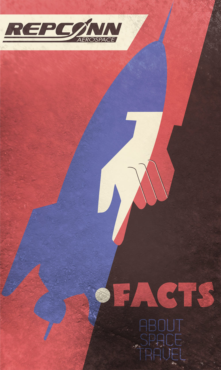
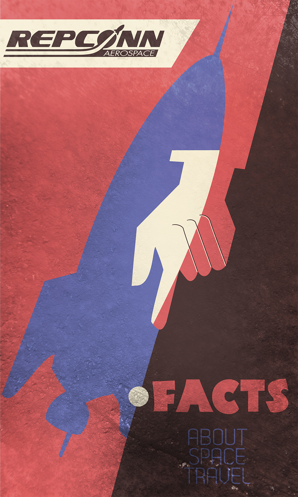
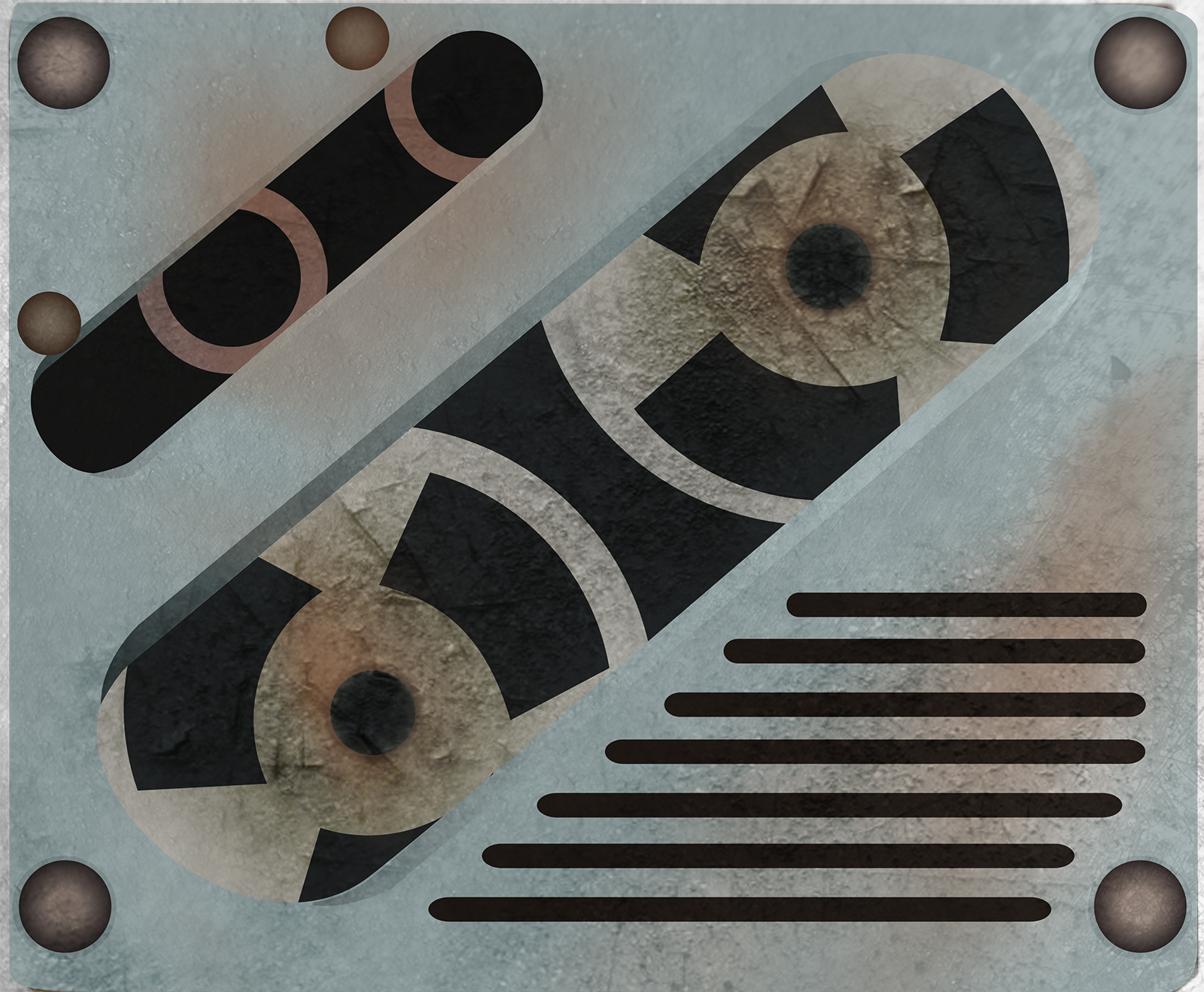
For fun I decided to add a “Repconn Facts About Space Travel” Brochure. Made from a “Facts about Air Travel” Brochure. I added a Cropped A5 print in with my project folder and has since been a part of my portfolio accompanying the main piece. Finally for a finishing touch I felt the whole package wouldn’t be complete if I had handed up the digital files on a plain blank CD-R. So to complete the package I handed the piece up in a CD case Styled as a Holotape from Fallout 3.
Years later I still enjoy this piece a lot. However I feel like the poster stuck too close to the original advert.


