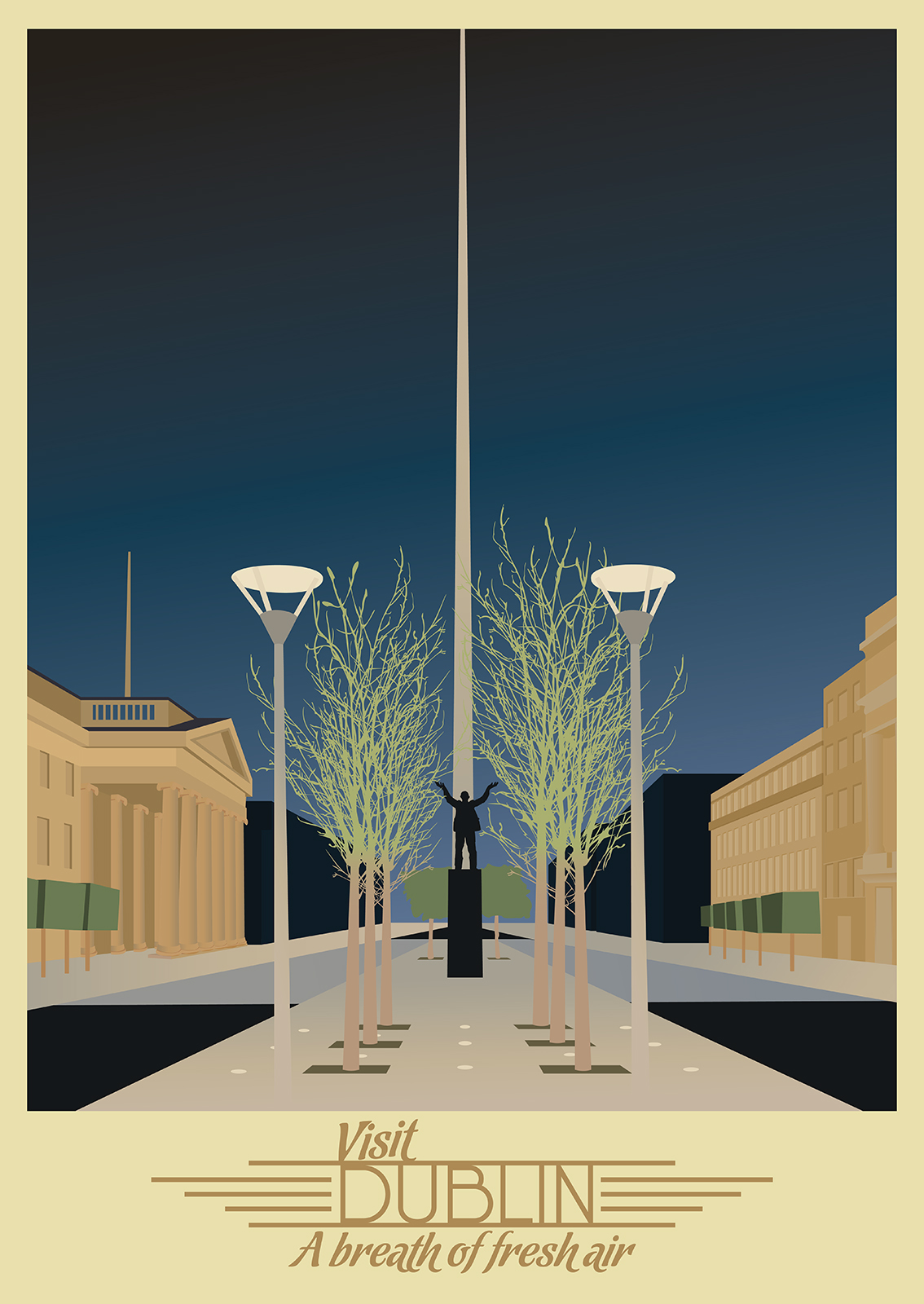
For the Dublin Poster I had an equally hard time deciding on the imagery I wanted to show. My initial idea was a composition including the Spire and the GPO. I had the opposite problem to my Cork Poster however. In this case there were too many reference images that I wanted the focus to be on, Henry Street at Christmas, The Ha’penny Bridge, a skyline of Dublin city or our family home. One of the references was of the statue of Jim Larkin on O’Connell Street I had an urge to use this piece as the pose of the statue felt so important to the Idea of Ireland and Dublin. I knew I would like to have the Image of Jim Larkin presenting my piece in a way. I felt my initial idea would still be best, I would show the Spire piercing through the centre with the GPO to one side and the statue of Jim Larkin holding up the spire dead centre.
Like the image of Cork I felt none of the reference images were symmetrical enough so once again I messed with the geometry of the scene and played with the location of the focus pieces in the composition to better suit the composition I wanted. This meant not sticking to the actual proportions of the features and the location of other features. This poster was built on multiple manipulations. I had used several different Images to create the final composition.
The colour pallet chosen for this image came as an experiment. I wanted to see if I could rely on a strict colour pallet from a single Art Deco poster. For the more Urban aethetic of Dublin I went with the famous image of “L’Atlantique” using the blacks and blues for the roads, background buildings and the sky. The background beige of the L’Atlantique poster was then used for the foreground buildings and the frame.
For Typography I wanted to leave the composition undisturbed and leave the type separate from the image. Part of the reasoning for this was that the Spire awkwardly cut through the type but this was also because I enjoyed the deep colours of the sky and any introduction of a lighter type softened the depth of the sky.
The phrase is the existing tourism slogan for Dublin and the typeface I chose for it was to mimic the existing style of the slogan. The Typeface for “Dublin” was taken from the different choices of Type I ran through on the cork poster. I felt with the use of the Streamline style wings the minimalism of the typeface would work well.
I generally love the streamline styled wings on many logos of the streamline/Art Deco period hence its use here. It is a common go to for me when I feel an Art Deco logo is lacking something and normally feel quite happy with it.
It was upon completion of this piece, on the Christmas Eve, that I was told my sister would be down on St. Stephens Day where gifts would be exchanged. This pushed my deadline closer than I expected. I would need to complete this image and two more within two days. It was possible but not easy and this would only be in the case that a Printers would be open on Stephens Day. Unfortunatly none were.
I had pushed on with the next two posters to hopefully get them finished by Stephens Day however plans changed again when I was told my sister would be down on the morning of St. Stephens Day. It was on Christmas morning that I also found out the January date that was initially given was also a red herring set by my sisters for a weekend trip they had organised for me. There would be no opporitunity to give Corinne my gift as a formal christmas gift other than Stephens Day. This all threw the deadlines out of order and so I told my sister on Stephens Day what I had been working on. I told her I would allow her to see the work I had done if she would like to at least see her gift. She refused and set a new deadline for New Years Eve where I would come down to Cork for the Christmas I expected. This gave me a tighter deadline than initially planned but a longer deadline than my new deadline. Ths allowed me to get the posters finished and printed on time and get them framed.

